Using Percentiles and Distributions to Evaluate Drilling Performance
Averages describe the center of a dataset, but they say little about repeatability, variability, tails, or what a rig has demonstrated consistently. Percentile distributions preserve much more of that information.
Consider two rigs.
Both have an average drilling-connection time of:
5.5 minutes
At first glance, their performance appears identical.
Now inspect the underlying events.
Rig A
Almost every connection takes between:
5.0 and 6.0 minutes
Rig B
Most connections take:
4.0 to 4.5 minutes
but a significant number take:
9 to 12 minutes
The average is the same.
The operational problem is not.
Rig A appears to have a consistently slower normal process.
Rig B has already demonstrated a much faster process, but something occasionally creates large delays.
If the objective is performance improvement, those two rigs should not receive the same recommendation.
This is why drilling performance is often better represented as a distribution than as one average.
The same issue appears in:
- ROP,
- connection time,
- trip speed,
- torque,
- MSE,
- tortuosity,
- slide duration,
- directional performance,
- bit-run metrics.
A single statistic compresses the population.
The distribution tells us what the population actually looks like.
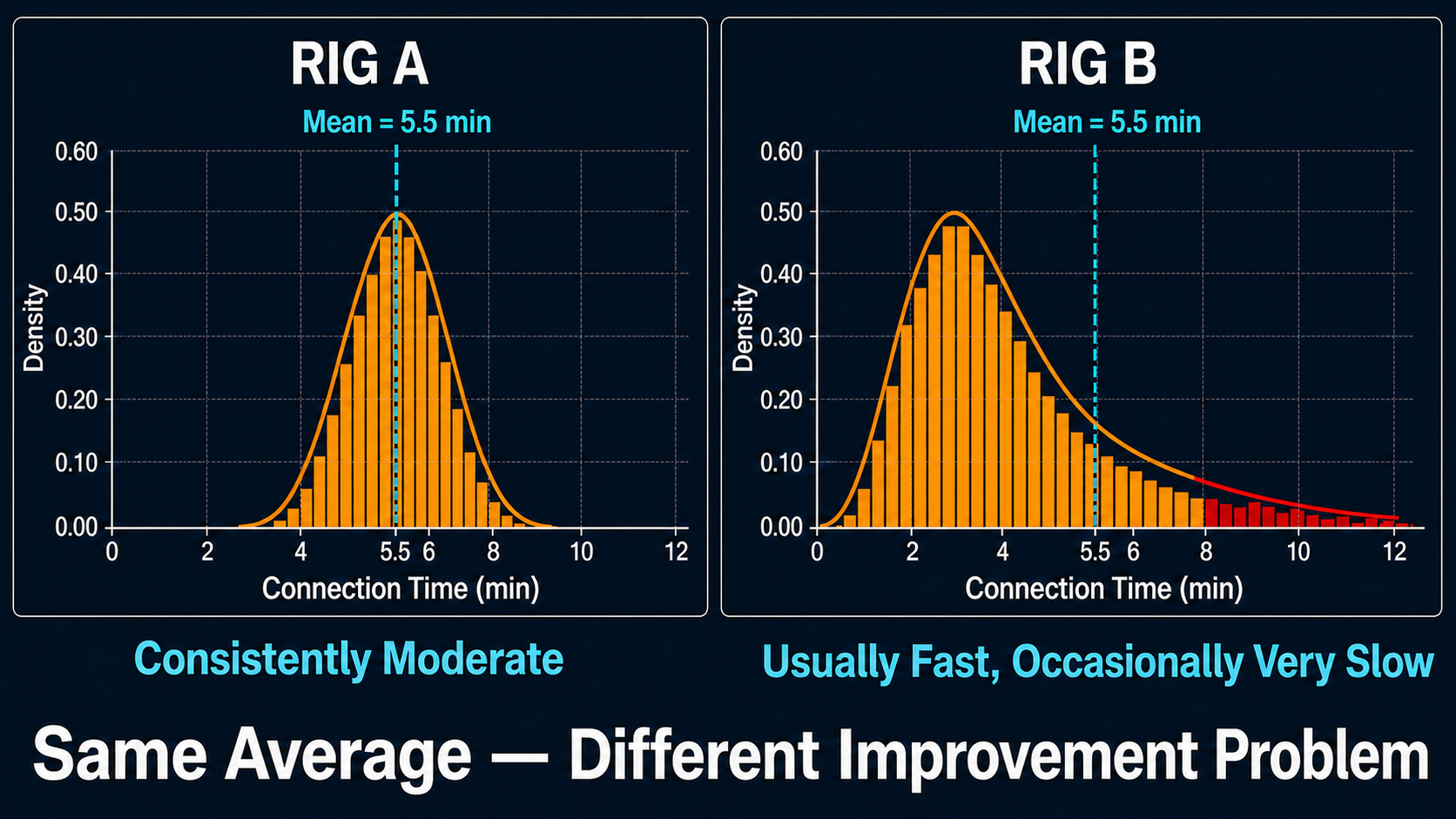
Two processes can share the same average connection time while requiring entirely different improvement strategies.
Why the Average Is So Popular
The arithmetic mean is useful because it is simple.
For observations:
$$x_1,x_2,\ldots,x_n$$
the mean is:
$$\bar{x} = \frac{1}{n} \sum_{i=1}^{n}x_i$$
It answers:
If all observations contributed equally, where is the balance point of the dataset?
For many engineering calculations, that is exactly what we need.
But drilling data frequently contains:
- skewed populations,
- long tails,
- transient events,
- mixtures of operations,
- outliers,
- changing formations.
In those situations, the mean can move substantially because of a relatively small number of observations.
That does not make the mean mathematically wrong.
It means it may not describe what an engineer intuitively thinks of as:
typical performance.
The Median Answers a Different Question
The median is the middle observation after the data is sorted.
Half of the observations lie below it.
Half lie above it.
Suppose connection times are:
4.3
4.5
4.6
4.7
4.9
5.0
5.1
5.3
11.8
The mean is approximately:
5.58 min
The median is:
4.9 min
Which better describes a normal connection?
Probably the median.
But the 11.8-minute event is still important.
The median should not be used as a convenient way to erase it.
It simply separates two different analytical questions:
What normally happens?
versus:
What abnormal or slow events also occur?
That distinction is exactly why the distribution should be retained.
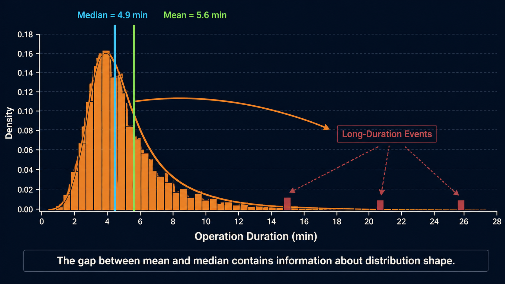
In a right-skewed duration distribution, a small number of long events pulls the mean above the median.
Real Drilling Studies Already Use This Logic
SPE-205844 provides a useful example.
The authors analyzed 1-Hz surface drilling data for PDC bit performance.
Rather than treat every instantaneous sample as an independent performance observation, they:
- filtered the data to rotary-on-bottom drilling,
- detected individual stands,
- calculated statistics within each stand,
- used a median wear metric for the stand,
- plotted those stand-level values against measured depth.
The median was selected partly to suppress local formation/noise effects and make longer-term trends easier to identify.[1]
The important lesson extends beyond bit wear.
Before choosing the statistic, the analyst first chose:
the correct operational population
and:
the correct analytical unit.
Only then did the statistical summary become meaningful.
Percentiles Describe More of the Distribution
The median is the 50th percentile:
$$P50$$
Other percentiles describe different parts of the population.
Using the conventional statistical definition:
P10
10% of observations are below this value.
P25
25% are below it.
P50
50% are below it.
P75
75% are below it.
P90
90% are below it.
Suppose rotary ROP for comparable stands has:
- P10 = 145 ft/hr
- P25 = 175 ft/hr
- P50 = 205 ft/hr
- P75 = 230 ft/hr
- P90 = 255 ft/hr
Now we know considerably more than:
Average ROP = 207 ft/hr
We can see:
- the lower performance range,
- the typical center,
- the repeatably strong population,
- the high-performance tail.
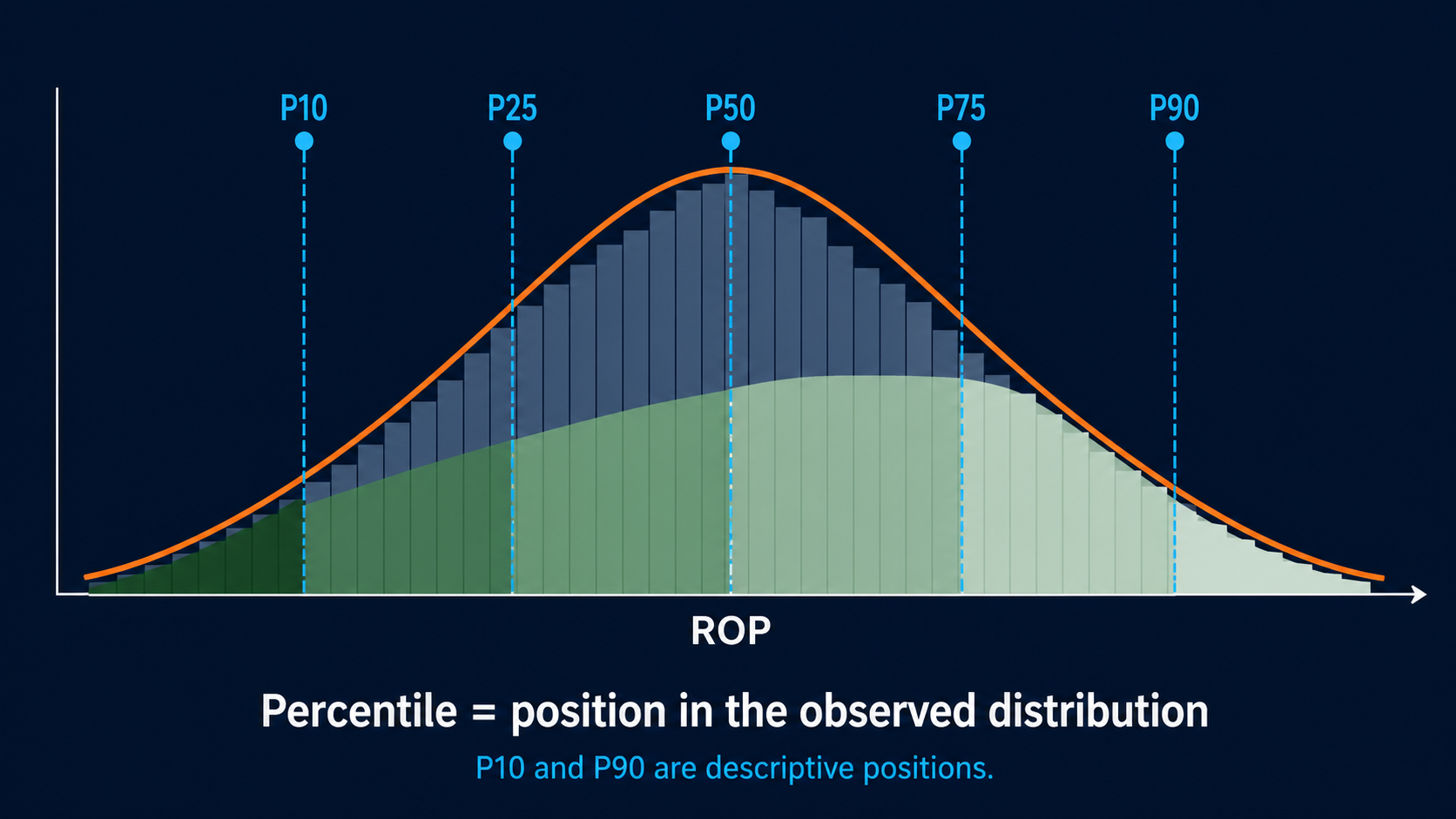
P10 through P90 describe positions in the observed ROP distribution; engineering context determines whether those positions are desirable.
P90 Does Not Always Mean "Good"
This terminology can create confusion in the energy industry.
In ordinary sample statistics:
$$P90 > P10$$
for a metric such as ROP measured numerically from low to high.
But engineers may also encounter exceedance-probability terminology in reserves and probabilistic forecasting where a "P90 case" can represent a conservative outcome.
Those conventions are not the same.
For drilling-performance analytics, the definition should therefore be explicit.
In this article:
P10 means the 10th sample percentile.
P90 means the 90th sample percentile.
No performance judgment is implied by the label.
Whether high or low is desirable depends on the metric.
ROP
Higher may generally be preferable, subject to drilling quality.
Connection time
Lower is preferable.
Tortuosity
Lower may generally represent smoother trajectory.
Excess torque
Lower may be preferable.
A percentile describes the location of an observation in a distribution.
It does not know what "good" means.
Percentiles Should Not Be Renamed Best and Worst
Consider connection time.
Suppose:
- P10 = 3.9 min
- P50 = 5.0 min
- P90 = 7.8 min
Calling:
P10 = Best
and:
P90 = Worst
is tempting.
But even that can oversimplify the interpretation.
Perhaps some longer connections included required:
- flow checks,
- well-control procedures,
- equipment inspections.
Those are not necessarily performance failures.
Statistics identify which events are unusual.
Engineering context determines whether they represent avoidable delay.
The Interquartile Range Measures Repeatability
A useful measure of spread is:
$$IQR = P75-P25$$
Suppose two rigs both have:
Median connection = 5.0 min
Rig A:
- P25 = 4.8
- P75 = 5.3
Therefore:
$$IQR=0.5\ min$$
Rig B:
- P25 = 4.1
- P75 = 6.6
Therefore:
$$IQR=2.5\ min$$
The medians are identical.
The processes are not.
Rig A is much more repeatable.
Rig B has a larger spread.
That creates different improvement questions.
Rig A
Can the entire stable process be made faster?
Rig B
Why are we sometimes fast and sometimes slow?
Repeatability itself is therefore a drilling-performance metric.
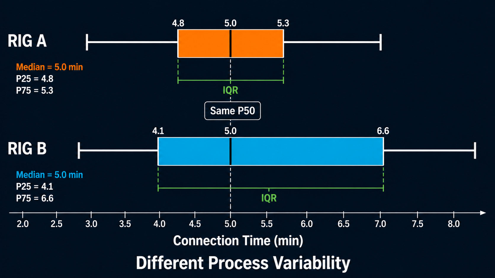
Equal medians do not imply equal repeatability: the IQR reveals the difference in ordinary process variation.
The Width of the Distribution Can Matter More Than the Center
Consider ROP.
BHA A
Median rotary ROP:
200 ft/hr
P25–P75:
190–212 ft/hr
BHA B
Median:
210 ft/hr
P25–P75:
145–260 ft/hr
Which BHA is better?
There is not enough information.
BHA B has a slightly higher median but substantially more variability.
The variation might indicate:
- changing formation,
- parameter experimentation,
- dysfunction,
- directional requirements,
- bit behavior.
BHA A may provide more predictable performance.
Or BHA B's variation may be entirely legitimate geology.
The statistical result narrows the investigation.
It does not replace the engineering interpretation.
The Analytical Unit Matters as Much as the Percentile
Suppose we calculate a P90 ROP.
P90 of what?
Possible populations include:
Raw 1-Hz samples
Every second is an observation.
One-foot bins
Every foot drilled is an observation.
Ten-foot intervals
Each interval has equal weight.
Stands
Each stand is one observation.
Entire wells
Each well contributes one section-level value.
Those distributions are not equivalent.
This is particularly important because drilling data is normally sampled uniformly in time.
As discussed in the time-versus-depth article, slow drilling generates more raw samples per foot than fast drilling.
If P90 is calculated from raw 1-Hz observations, slow footage contributes more observations.
If P90 is calculated from equal-footage bins, each foot or interval receives equal statistical representation.
Neither method is universally correct.
The analyst must define the population.
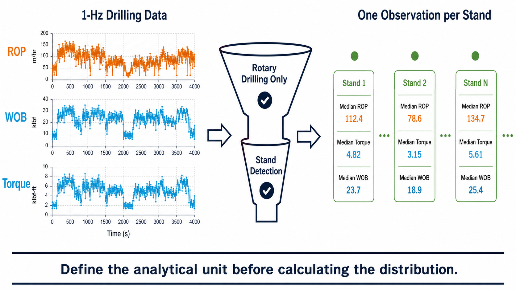
Raw one-hertz samples and stand-level summaries define different populations; the analytical unit must be chosen before calculating percentiles.
A Percentile Without a Population Definition Is Incomplete
A KPI description such as:
P90 ROP = 235 ft/hr
should ideally answer:
- rotary or slide?
- which formation?
- what hole section?
- which depth range?
- raw samples or stands?
- footage weighted or time weighted?
- which wells?
- what date range?
Without those definitions, the number can be technically correct and analytically meaningless.
A more defensible description is:
P90 stand-level rotary ROP for 8.75-in lateral footage in Formation A across six comparable wells.
Now the population is interpretable.
Rig State Must Come Before the Distribution
Suppose an ROP distribution contains:
- rotary drilling,
- slide drilling,
- reaming,
- off-bottom data.
The statistical calculation may be flawless.
The population is not.
The same applies to:
- torque,
- WOB,
- RPM,
- differential pressure.
A distribution should normally be formed after relevant operational-state filtering.
For example:
Rotary ROP distribution
should represent rotary drilling.
Slide duration distribution
should represent slides.
Connection-time distribution
should represent comparable connections.
This is one reason statistics cannot compensate for poor data engineering.
The population has to be physically meaningful before the percentile is useful.
Mixed Formations Can Create a Misleading Distribution
Consider two formations.
Formation A
Typical ROP:
180–220 ft/hr.
Formation B
Typical ROP:
80–120 ft/hr.
Suppose Rig 1 drilled much more footage in Formation A.
Rig 2 drilled more Formation B.
Pooling all footage might show:
Rig 1 has higher median ROP.
That does not establish superior drilling performance.
The result may simply describe a different geological mix.
This is one of the most common risks in performance benchmarking:
a distribution can accurately summarize an unfair population.
The solution is not more sophisticated statistics.
It is better normalization.
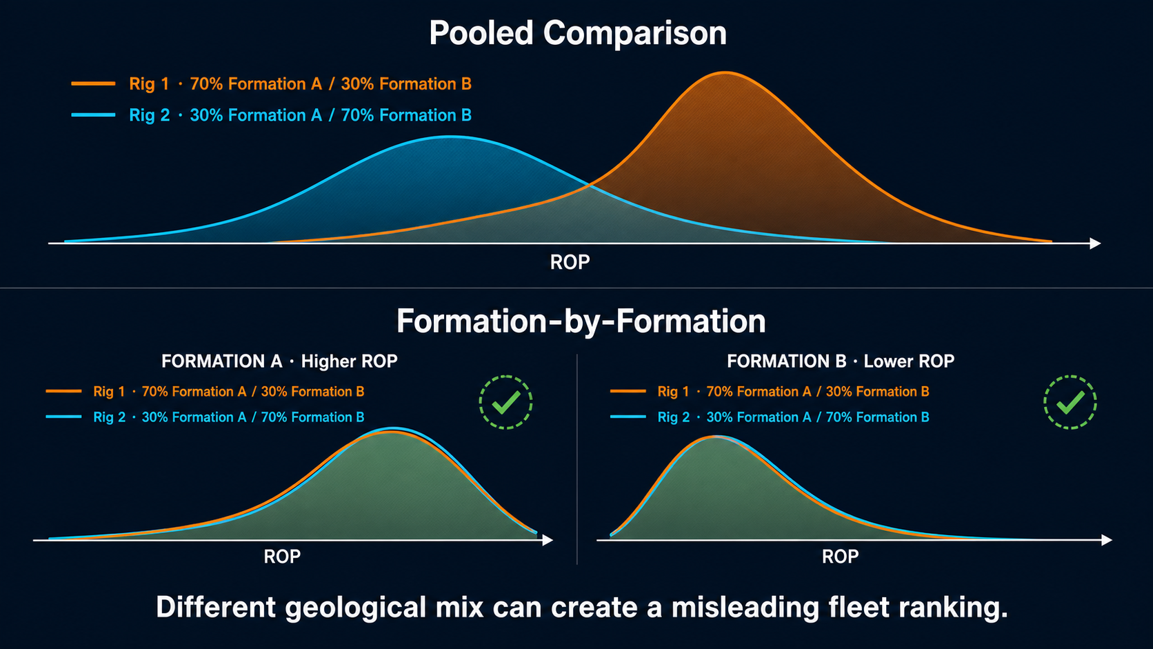
Pooling different formation proportions can create a misleading rig ranking even when within-formation performance is similar.
This Is Related to Simpson's Paradox
There is a useful statistical concept behind this problem.
A trend observed in aggregated data can weaken, disappear, or even reverse when the data is separated into relevant subgroups.
In drilling, those groups might be:
- formations,
- hole sections,
- rigs,
- BHA types,
- rotary/slide states.
Suppose Rig A has better ROP than Rig B in:
- Formation X,
- and Formation Y.
But Rig A drilled proportionally much more of the difficult Formation Y.
Its overall average could still appear lower.
The aggregated ranking would be misleading.
The practical lesson does not require remembering the name of the paradox.
It is simply:
Compare like with like before aggregating.
P10 and P90 Are Useful for Defining an Operating Envelope
Percentiles can be especially useful when historical data is being converted into an operating benchmark.
Suppose comparable historical rotary drilling shows:
WOB:
- P10 = 27 klbf
- P50 = 34 klbf
- P90 = 41 klbf
RPM:
- P10 = 105
- P50 = 125
- P90 = 145
These values should not automatically become:
minimum / target / maximum
because the WOB and RPM distributions are not independent.
But they provide an immediate sense of the range historically used.
Combined with:
- ROP,
- dysfunction,
- formation,
- BHA context,
the percentiles can help establish a historical operating envelope.
This is more informative than:
Average WOB = 34 klbf
because it shows how much the operating parameter actually varied.
Percentiles Can Distinguish "Typical" from "Demonstrated Strong"
This is one of their most useful applications.
Suppose connection-time distribution is:
- P10 = 4.0 min
- P25 = 4.4
- P50 = 5.1
- P75 = 5.9
- P90 = 7.2
The fastest recorded connection might be:
3.1 min
Should 3.1 become the target?
Probably not automatically.
It may be a one-off event.
But P10 or P25 tells us that relatively fast performance has been demonstrated repeatedly.
That makes it potentially more defensible as an improvement benchmark.
A useful framework is:
Typical
P50.
Repeatably strong
perhaps P25 for a lower-is-better metric.
Exceptional
near the extreme tail.
The exact percentile selected should depend on the purpose rather than becoming a universal rule.
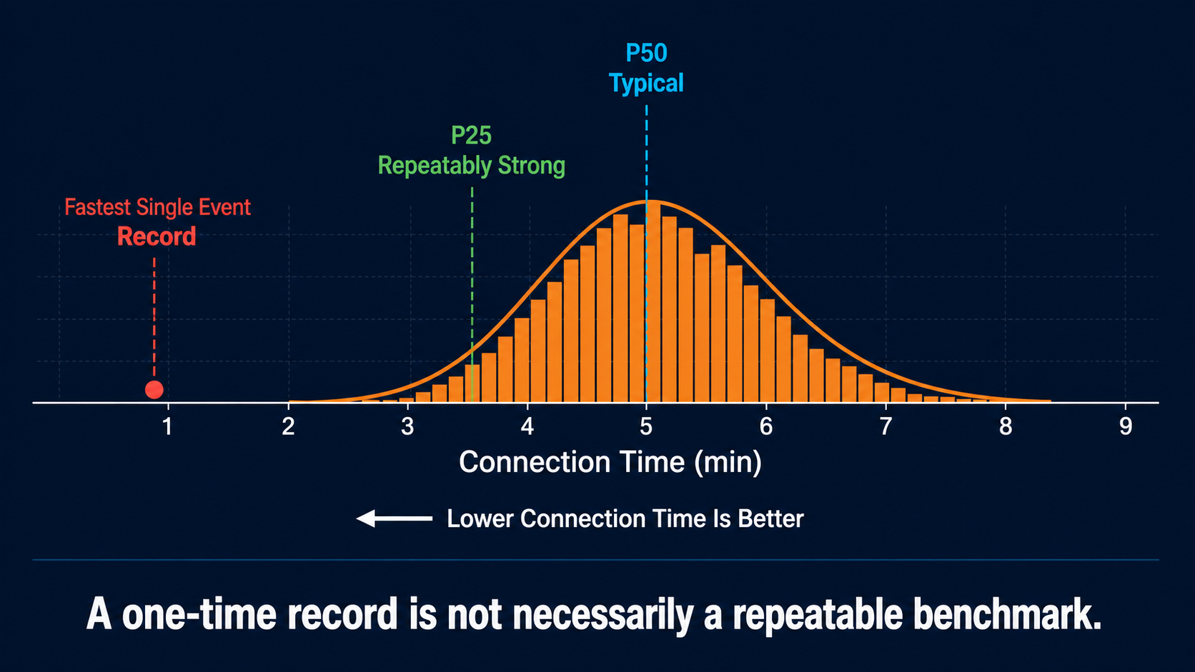
A repeatedly demonstrated strong connection time is a more defensible benchmark than one isolated record event.
"Best Quartile" Changes Direction by Metric
This is another reason labels matter.
For connection time:
lower is better.
So the faster quartile lies toward the lower numerical end.
For ROP:
higher is generally better.
So the stronger numerical quartile lies toward the upper end.
For some metrics:
the optimum may be in the middle.
For example, very high WOB is not automatically better than moderate WOB.
Therefore a dashboard should preferably display:
P25 / P50 / P75
rather than:
bad / average / good
unless an engineering rule defines what good actually means.
Percentiles are descriptive statistics.
Engineering criteria assign desirability.
Extreme Percentiles Need Enough Data
Suppose only eight BHA runs are available.
What does P90 really mean?
There are not enough observations for a stable estimate of the upper tail.
Likewise, calculating P99 from 20 events creates a number, but it conveys more numerical sophistication than the dataset supports.
Extreme percentiles become more useful as sample size increases.
With small datasets:
- median,
- quartiles,
- individual points
may be more transparent.
This is important because drilling comparisons often involve small populations:
- three offset wells,
- six BHAs,
- two crews.
A P90 label does not magically make a six-well comparison statistically robust.
SPE/IADC-194184 makes a related point in its performance analysis: the authors compared 25 wells across four rigs but explicitly warned that the dataset was still limited for drawing strong causal conclusions and that numerous operational factors affected performance.[2]
The same caution applies to percentile interpretation.
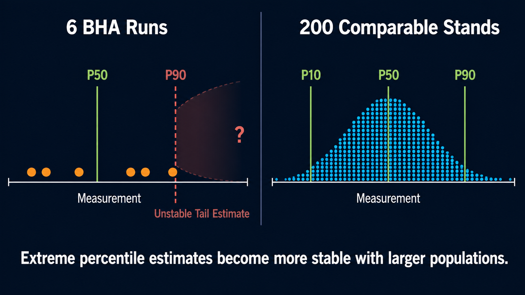
With only six BHA runs, a tail percentile is fragile; a larger comparable population supports a more stable estimate.
Percentiles Also Depend on the Calculation Method
With a very large dataset, different standard quantile algorithms usually produce similar results.
With small samples, they can differ.
Software packages may interpolate between neighboring observations differently.
For ordinary drilling dashboards, this is rarely the dominant engineering uncertainty.
But for reproducible benchmarking, it is useful to store:
- algorithm/library definition,
- sample population,
- processing version.
If one report calculates P90 using one method and another platform uses another, a small discrepancy does not necessarily indicate a data problem.
Outliers Should Be Investigated Before They Are Removed
Suppose a torque distribution has several extreme high values.
A conventional data-cleaning routine might classify them as outliers.
But drilling outliers can represent:
- stick-slip,
- pack-off,
- ledge interaction,
- equipment problems,
- sensor faults.
The correct question is not:
Is this point statistically unusual?
It is:
Why is this point unusual?
A faulty sensor and a real mechanical event can both occupy the tail of a distribution.
Only one should be removed as invalid data.
This connects percentile analysis directly back to sensor validation and operational-state detection.
Mean, Median, and Percentiles Should Often Be Shown Together
There is little reason to make these statistics compete.
A compact summary can show:
Average: 189
P10: 179
P50: 188
P90: 202
Now the reader knows:
- center,
- skew,
- spread.
If mean and median are very different, the distribution may be asymmetric or contain influential tails.
That itself is useful information.
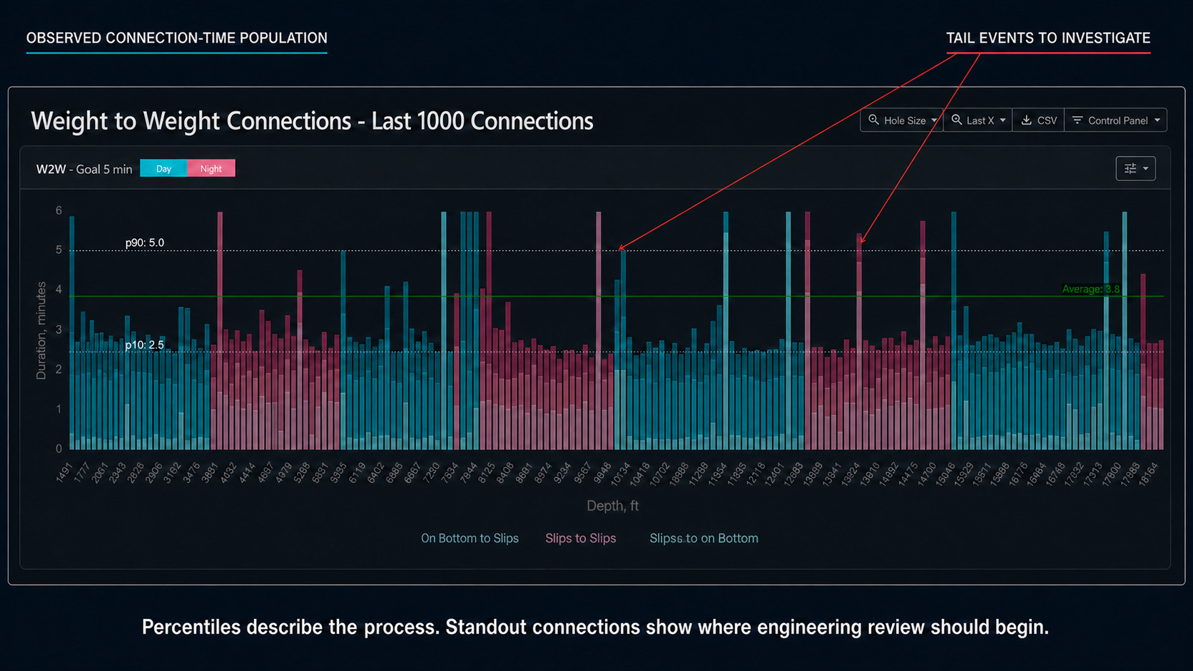
The P10, average, and P90 context makes unusually slow connection events easy to isolate for engineering review without redefining them as the benchmark.
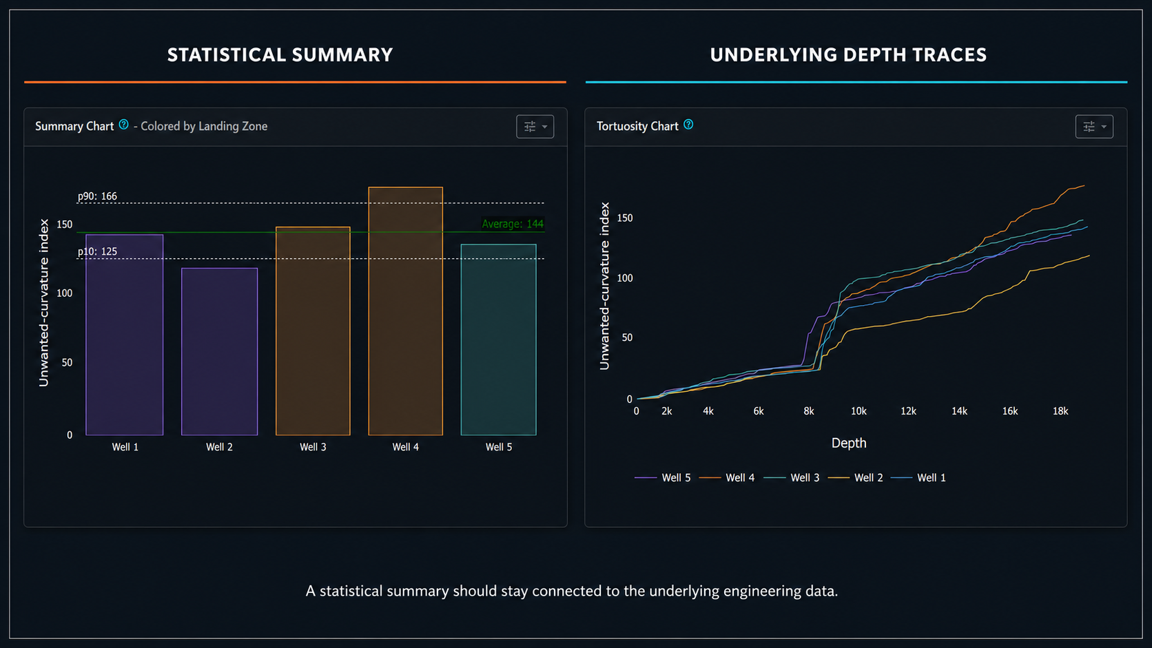
The statistical summary identifies which wells differ; the depth traces show where those differences develop.
The Summary Should Never Replace the Underlying Data
Suppose BHA A has:
Tortuosity index = 182
and BHA B:
Tortuosity index = 198
The summary makes BHA A look better.
But perhaps BHA B's higher value comes almost entirely from one localized interval.
That information may matter operationally.
A bar chart answers:
Which well had the higher total metric?
The depth trace answers:
Where did the difference originate?
Both are useful.
The distribution summarizes.
The trace explains.
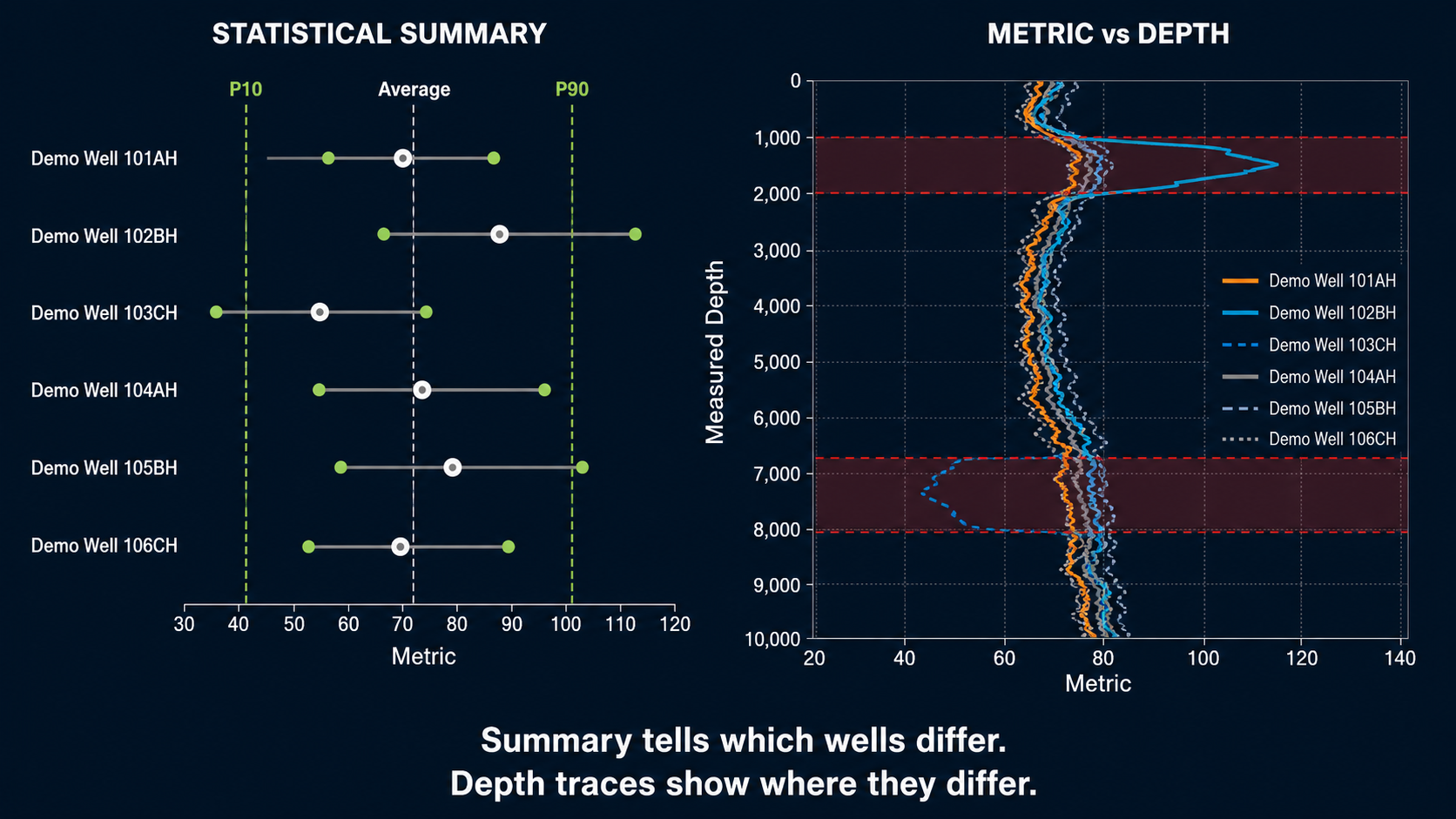
A compact statistical comparison should remain traceable to the depth intervals that produced it.
A Practical Multi-Well Example
Consider eight comparable lateral wells.
Their section-level metric values are:
178
181
184
187
190
193
198
221
Mean:
$$191.5$$
Median:
$$188.5$$
The high value of 221 pulls the mean upward.
Suppose further investigation shows that the 221 well contains one severe directional interval.
Now several pieces of information are useful:
Median
describes the center of the typical well population.
P10–P90
describes the broader historical range.
Maximum
identifies the extreme case.
Depth trace
reveals where that case became different.
No one statistic contains all four insights.
A Practical ROP Example
Suppose rotary stands in one formation produce:
Rig A
- P25: 176 ft/hr
- P50: 202
- P75: 222
- IQR: 46
Rig B
- P25: 185 ft/hr
- P50: 205
- P75: 213
- IQR: 28
If we compare only medians:
the rigs look almost identical.
But Rig B is more tightly distributed.
Now suppose Rig A's high variability comes from its first three wells, while its newest wells look like Rig B.
The next analysis is obvious:
Has the process changed over time?
That is exactly what a good statistical summary should do.
It should generate better engineering questions.
Percentile Trends Can Detect Process Change
Percentiles do not have to be calculated only once over the entire historical dataset.
They can be evaluated over:
- wells,
- pads,
- months,
- crews,
- campaigns.
For example, connection times over five wells might show:
| Well | P25 | P50 | P75 |
|---|---|---|---|
| 1 | 4.7 | 5.4 | 6.4 |
| 2 | 4.6 | 5.2 | 6.0 |
| 3 | 4.3 | 4.9 | 5.4 |
| 4 | 4.2 | 4.7 | 5.0 |
| 5 | 4.1 | 4.6 | 4.9 |
Two things have happened:
- the median improved,
- the distribution tightened.
That is stronger evidence of process improvement than one record-fast connection.
A Good Benchmark Contains Location and Spread
Instead of saying:
Target ROP = 220 ft/hr
a more informative historical description might be:
Comparable rotary footage
- median = 200 ft/hr
- P25–P75 = 175–225
- P90 = 248
Then an engineer knows:
- typical performance,
- common variation,
- demonstrated upper-end behavior.
The target can still be 220.
But now the target exists inside a historical distribution rather than appearing as an unexplained number.
Do Not Confuse Percentiles with Prediction Intervals
Historical P10/P90 values describe the distribution that was observed.
They do not automatically mean:
There is an 80% probability that the next well will fall between these values.
That stronger statement requires assumptions about:
- representativeness,
- independence,
- future conditions,
- statistical model.
This distinction is subtle but important.
A historical percentile is descriptive.
A forecast interval is predictive.
The two should not be labeled interchangeably.
A Practical Statistical Workflow
A defensible drilling-performance workflow could be:
1. Define the engineering question
What is being compared?
- ROP?
- connection time?
- tortuosity?
- trip speed?
- BHA performance?
2. Define the population
Specify:
- formation,
- section,
- rig state,
- BHA class,
- relevant operating context.
3. Define the analytical unit
Use:
- event,
- stand,
- footage interval,
- well
rather than blindly using raw sensor samples.
4. Validate the data
Separate:
- real operational extremes,
- from sensor faults.
5. Calculate the center
Typically:
- mean,
- median.
6. Calculate spread
Examples:
- P10/P90,
- P25/P75,
- IQR.
7. Inspect the distribution
Look for:
- skew,
- multiple populations,
- long tails,
- isolated extreme observations.
8. Compare the underlying traces
Find the physical reason for the statistical difference.
9. Preserve metadata
Record:
- population definition,
- weighting,
- percentile convention,
- processing version.
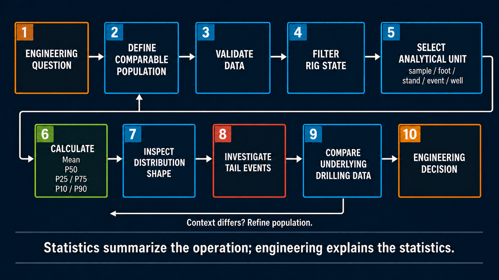
A defensible distribution analysis starts with a comparable population and ends with an engineering decision—not with the percentile calculation.
A Performance Dashboard Should Answer More Than "What Is the Average?"
A useful drilling-performance card might contain:
P50
What normally happens?
P25 / P75
How much does the process normally vary?
P10 / P90
What does the broader operating range look like?
Sample count
How much evidence supports the distribution?
Underlying traces
Why did the values differ?
That transforms a KPI from one number into a compact description of process behavior.
The Distribution Is Often the Performance Story
Drilling operations contain unavoidable variability.
Formation changes.
Bit condition changes.
Directional requirements change.
Human workflows vary.
The objective of statistics is not to make that variation disappear.
It is to characterize it.
An average can tell us where the population balances.
A median can tell us what is typical.
Percentiles can tell us the range that occurs repeatedly.
The IQR can tell us how controlled the process is.
The tails can tell us where the interesting events live.
And the underlying drilling data tells us why.
The strongest performance analysis therefore does not ask only:
What was the average?
It asks:
What does the distribution look like, which population produced it, and what engineering behavior explains its shape?
That is a much richer basis for improving the next well.
References
-
Witt-Doerring, Y., Pastusek, P. P., Ashok, P., and van Oort, E. Quantifying PDC Bit Wear in Real-Time and Establishing an Effective Bit Pull Criterion Using Surface Sensors. SPE-205844-MS, SPE Annual Technical Conference and Exhibition, 2021.
-
Behounek, M., Millican, B., Nelson, B., Wicks, M., Rintala, E., White, M., Thetford, T., Ashok, P., and Ramos, D. Change Management Challenges Deploying a Rig-Based Drilling Advisory System. SPE/IADC-194184-MS, SPE/IADC International Drilling Conference and Exhibition, The Hague, 2019.
-
Shahri, M., James, M., Vasicek, A., De Napoli, R., White, M., Behounek, M., D'Angelo, J., Ashok, P., and van Oort, E. Case Studies: Optimizing BHA Performance by Leveraging Data and Advanced Modeling. SPE-196020-MS, SPE Annual Technical Conference and Exhibition, Calgary, 2019.